It's long been a conviction of mine -- and as usual this is based on observation and not upon prejudice -- that academic talks with witty and dramatic titles tend towards tedium, whereas those with more workmanlike names can often surprise. Obviously, this doesn't work across the board, but it's a good rule of thumb, and one that first struck me when I attended a talk entitled 'Oaths, Omens, and Abominations' and found myself learning about Greek grammar.
The tragic aorist, to be particular.
I'm not saying it wasn't a good talk -- it was, and it's one where I really learned stuff -- but it certainly wasn't what I felt I'd signed up for.
In contrast, many's the talk I've attended with a dull title that's turned out to be utterly fascinating. Again, I'm not saying that all talks with uninspiring names prove inspirational; a serious contender for the worst talk I've ever attended had the kind of boring title that trained eyes recognised as promising hidden pleasures, but proved both condescending and deeply flawed, delivered in a ponderous manner and accompanied by an atrocious Powerpoint presentation, the nadir of which was an utterly incomprehensible flowchart.
Afterwards, as my colleagues made sure to take away their handouts lest the speaker notice the scathing comments they'd scrawled upon them, I remarked that I hoped the speaker was to be made pay for her own dinner; a friend who wound up seated opposite her during the meal then spent a tortuous two hours desperately trying to avoid discussing her paper.
Still, the principle holds, I think. Don't trust exciting titles, as they merely raise hopes, while things that seem functional and mundane can have poetic depths.
One of my favourite non-fiction books has perhaps the most soporific name of any book on my shelves, it being Edward Tufte's The Visual Display of Quantitative Information. Dull of title it may be, but the book's a thing of rare beauty, and is one of those things that could change how you look at the world.
Scathing of charts and diagrams that are cluttered with useless or distracting information, and damning of those that mislead, Tufte sings the praises of elegant diagrams that convey large amounts of information in a clear and efficient way, especially those that do so in a narrative fashion. Not every picture's worth a thousand words, but some are worth that and more.
John Snow's cholera map, showing how outbreaks of the disease were distributed in the 1854 London epidemic, is recognised by Tufte as an exemplary instance of quantitative information being displayed visually, but the real highlights of his book are the nineteenth-century creations of the French engineers Ibry and Jean Joseph Minard.
Perhaps Ibry's most ingenious creation is this Paris-Lyons train timetable, as published by Étienne-Jules Marey in 1885. The horizontal axis reflects the time of day, while stations are placed proportionately by distance along the vertical axis. Southward-bound trains descend from left to right, while northward ones ascend from left to right. The table reveals an immense amount of information at a glance, with, for instance, it being immediately obvious that the steepest lines indicate the fastest trains.

There's no denying that this isn't all that clear when reproduced on a small size, but at its original larger scale it would have been admirably clear. Tufte's applied Ibry's methods to other modern timetables with impressive results, which really just leaves one wondering why this system hasn't been commonly adopted by transport authorities around the world.
Minard's historical maps are perhaps even more remarkable than Ibry's timetable. Indeed, Tufte is of the view that this 1869 map, depicting Napoleon's doomed march on Moscow, may well be the greatest statistical graph of all time, defying the pen of the historian, as Marey said, in its brutal eloquence.

The thick upper band depicts the advancing army as it sets out from the Polish-Russian border towards Moscow, the band narrowing along the way as thousands of men deserted and thousands more died through cold, starvation, typhus, and suicide; 422,000-strong at the beginning of the invasion, hardly more than a 100,000 reached Moscow.
The dark lower band -- tied to to temperatures along the route -- represents the broken and shrinking army's desperate retreat through the bleak and deadly Russian winter, harassed along the way by Russian peasants and irregular troops, such that barely 10,000 returned across the Neman.
The dark lower band -- tied to to temperatures along the route -- represents the broken and shrinking army's desperate retreat through the bleak and deadly Russian winter, harassed along the way by Russian peasants and irregular troops, such that barely 10,000 returned across the Neman.
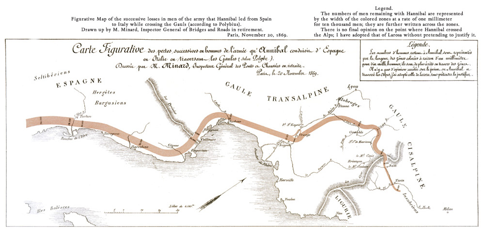
I was horrified and thrilled when I beheld this map for the first time, as me being me I wondered whether Minard's methods could be applied to a similar map depicting Hannibal's march; surely, I thought, that'd be a boon to any book on his Italian invasion. Well, I discovered as I read on, Minard had beaten me to it and rendered such a map more gracefully than ever I could have done.

Working from Polybius' second-century figures, and following -- it would seem -- the route postulated by Jean-Louis Larauza, Minard showed how Hannibal's army set off from Cartagena with about 90,000 infantry and 12,000 cavalry, but after leaving men behind at the Ebro river to protect Punic Spain, continued to decline in numbers as it crossed the Pyrenees, Gaul, the Rhone, and especially the Alps, such that it eventually arrived in Italy reduced to a mere 20,000 infantry and 6,000 cavalry.
Granted, this map takes Polybius' figures at face value, which I wouldn't do -- all else aside, I rather suspect that Polybius' figures exclude Hannibal's skirmishing troops who he regularly refers to as euzdonoi as distinct from pezdoi, his standard word for infantry -- but it nonetheless strikes me as an eloquent and valuable visual aid, and the kind of thing which should feature more often in modern books.
Dry it may look, but Tufte's book is an absolute wonder, and a call to arms. We shouldn't rely on lazy cookie-cutter diagrams or clutter our work up with noise and effects, the kind of sound and fury that signifies absolutely nothing. We can do so much better.


1 comment:
Speaking of diagrams and clarity, upon arrival as a teenager in London some 50 years ago, I was most impressed by the ubiquitous maps of the London Underground. They were simple, clear, color-coded and uncluttered. Additionally, the carriages had diagrams of the particular line one was on, so one’s progress could be followed clearly.
Subsequently, when asked if I had seen much of London, I would reply that while I may not have been “all over” London, I had certainly been “all under” it…!
Post a Comment